At the beginning of February 2011, Google Docs underwent a "refresh" of its Document List. The result of this change has been to turn a useful list into something that, from a usability standpoint, is a complete and utter disaster. Something that is really not worthy of Google.
Although I would rather be spending my time doing other more productive things, I am taking time out to write this because: a) I have some time available while my wife is away on business! and b) I feel that Google needs to take note that, unusually for them, they have released something that is way below their usual standards. It does not seem to have been tested at all by users who do real work with Google Docs. If it had, it would never have seen the light of day. Perhaps the Google Docs team is subconsciously ashamed of this poor piece of work because when you click the "New Features!" link at the top, no mention is made of this refresh (this was the case on 5 February 2011). If I had been responsible for this debacle, I would not have liked to mention it either!
Let's take a look at what's wrong by comparing the two versions.
Here is the older version's Documents List before it got "refreshed":
This is how the refreshed Documents List appears in the newer version:
 |
| Older Version |
This is how the refreshed Documents List appears in the newer version:
 |
| Newer Version |
Looking at the older and newer versions next to each other, there are some very striking differences.
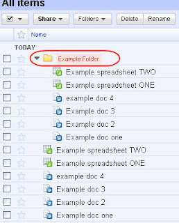
Note: Collection identifiers (folders) are now appearing in the older version, too. This happened at the same time as the newer version was released. If you click on a collection identifier (folder) you will see the documents within that collection. But we also see the documents in other collections as well because we have All Folders set. So now we have the main pane cluttered with duplicated documents. This is quite absurd.
See the example to the right taken from the older version. As you can see, if you click on "Example Folder", the file names appear twice! So not only is the newer version awful, Google has also managed to muck up the older version too.
Interestingly, in the newer version, if you drill down on the "Example Folder" collection (by clicking on it), you just see those documents in that collection. So the behaviours are different between the two versions.
But the point is that these collection identifiers (folders) should only appear in the left hand pane, they should not be in the main pane.
Having just made the screenshot to the right, I now see that in the older version the collection identifiers (folders) are no longer appearing in the main pane !!! There seems to be a stability issue at play, too. If I switch back to the newer version and then switch back again to the older version, the folders re-appear!
F. Refresh Link Removed The "Refresh" link in the older version (visible top right) has gone in the newer version. So you make a change in a document but that change is not reflected back in the Google List window. You have to hit the F5 key to get an up-to-date view of the document list. Another oversight?.
 G. File Count The very useful file count in the older version that told you how many files were in a particular folder has been removed in the newer version - sacrificed to the God of minimalism. To get a file count in the newer version the user is forced to jump through hoops by going through some of the steps to download a collection (which, by the way, you could also do in the older version). Pain but no gain. Absolutely stupid.
I know there are other serious problems with this refresh, particularly for users who are administrators. I am only attempting to deal with the user interface changes (that's keeping me busy enough) but for details of what others have found, see the links below and probably elsewhere on the internet. I sincerely hope that Google does not decide to make this refresh permanent. It needs a ton of work before it is ready for prime time. In the meantime, they should make the older version the default and admit that they have got it wrong big time.
Other users' opinions:
The majority of users who have posted comments are extremely unhappy with this ridiculous refresh. And many of these users are "power users" who would normally welcome sensible improvements. I would imagine that customers who are paying for Google Docs and using it for their livelihood will consider looking elsewhere (Dropbox?) as soon as the "Older version" link is threatened with removal.
* Here are the reactions of other users posting on the Google Docs Blog page:
http://googledocs.blogspot.com/2011/01/refresh-to-documents-list.html
* Here is what people have to say on the Google Docs help forum:
http://www.google.com/support/forum/p/Google+Docs/label?lid=1222793079d1eddb&hl=en
* Here are my original observations in the same Google Docs help forum:
http://www.google.com/support/forum/p/Google+Docs/thread?tid=327b78beafe120ba&hl=en
Some choice quotes from the Google Docs user community:
11 February 2011
A. At-a-glance metadata In the older version, metadata for each file (such as the date, the shared status, and who last worked on the file) can be viewed on screen for all visible files. In the newer version, however, this metadata is not visible in the main pane and has been replace by lots of "cool" white space. The metadata is viewable in the right-hand pane but the user has to click on each file in turn to view these details (taking care not to click on the file's link - that will open the file in another browser window).
This is a massive backward step in usability.
B. Label colouring The label colouring has been tinkered with too, and not for the better. In the older version, the labels followed Gmail's good design with a solid coloured background. In the newer version, the colouring has been reduced to a "cool" thin bar on the left of the label. This is much worse for three reasons:
1. It is now harder to see at a glance what the label is (this is particularly true of similar colours such as light green and dark green). Look at the two examples. Anyone can see that the older version is far clearer. Why make this change?
Edited on 5 March 2011:
2. Labels are still different from those in Gmail (and worse). The goal should surely be to make Google's various web applications look and work in the same way as far as possible. Making the labels look different from those in Gmail (which serve their purpose excellently) is just tinkering and is a classic case of style over substance. Except that here the style is so poor and fails miserably.
 3. Half the number of colour schemes. The number of label colour schemes available has been reduced from 24 to 12. Why? Because with the new colour strip on labels, it is no longer possible to select the 12 colour schemes that use coloured text (on a pastel background) rather than a full coloured background. To make this clearer, on the right you can see the 24 colours that are available in the older version. In the newer version, 12 of them have been removed, thereby degrading the user experience. And the reason for this is the ridiculous "cool" redesign of the labels themselves.
C. Checkboxes and File Selection The older version had checkboxes to the left of each file. The newer version has done away with checkboxes and relies on the standard Windows way of doing things to highlight a file. (Multiple files can be highlighted by clicking while holding down the Control or Shift key.) Again this seems a backward step for at least five reasons:
1. It is less easy to select multiple files. You now have to use two hands, one holding down the control or shift key and the other clicking the mouse. Hopeless!
2. It is less easy to select all files. You now have to select the first one and then scroll down to the last file in the window and click while holding down the Shift key. The Google Docs team could have used Gmail's innovative checkbox-cum-dropdown list control which works well. But no, they had to do things differently.
3. Keyboard navigation is not possible (as far as I know) to move up and down the list. I realise it was also not possible in the older version either but, again, the Google Docs team could have adopted Gmail's elegant use of the "j" and "k" keys to move up and down and the "x" key to select/deselect files. This would have been a welcome improvement but it hasn't happened.
4. It breaks the integration of look and feel between Google's applications (Gmail has checkboxes). Instead of making Google's various applications work in similar ways wherever possible, the Google Docs team has done its own (inferior) thing. Rather than integrating its application with others in the Google family, disintegration seems to be preferred!
5. Harder to select file without accidentally opening it. When selecting a file, it is too easy to click the file link itself (which opens the file) instead of the space to the left or right of the link.
Point 6. added on 27 February 2011:
6. Much easier to lose selections. If you are using Ctrl+click to select multiple files, and you accidentally release the Ctrl key while clicking a file, all your selections are lost. Of course this does not happen with check boxes.
D. File Type Icons The icons identifying the types of file (document, spreadsheet, PDF, etc) have also been subjected to a pointless redesign.
1. Icons are now smaller and less easy to identify at a glance. Brilliant! Why do this? What was wrong with the icons in the older version? They worked well. Change for change's sake is not a good use of development time.
This is a massive backward step in usability.
B. Label colouring The label colouring has been tinkered with too, and not for the better. In the older version, the labels followed Gmail's good design with a solid coloured background. In the newer version, the colouring has been reduced to a "cool" thin bar on the left of the label. This is much worse for three reasons:
1. It is now harder to see at a glance what the label is (this is particularly true of similar colours such as light green and dark green). Look at the two examples. Anyone can see that the older version is far clearer. Why make this change?
 |
| Newer Version |
 |
| Older Version |
Point 1) above. The Google Docs team has tinkered again with label colouring and have now extended the colouring to the entire border of the label. It's slightly better but as you can see, it's not a patch on the older version's colouring which is much clearer. Why not just go back to the older version's full colouring?
 |
| Newer Version - Revised on 4 March 2011 |
2. Labels are still different from those in Gmail (and worse). The goal should surely be to make Google's various web applications look and work in the same way as far as possible. Making the labels look different from those in Gmail (which serve their purpose excellently) is just tinkering and is a classic case of style over substance. Except that here the style is so poor and fails miserably.
C. Checkboxes and File Selection The older version had checkboxes to the left of each file. The newer version has done away with checkboxes and relies on the standard Windows way of doing things to highlight a file. (Multiple files can be highlighted by clicking while holding down the Control or Shift key.) Again this seems a backward step for at least five reasons:
1. It is less easy to select multiple files. You now have to use two hands, one holding down the control or shift key and the other clicking the mouse. Hopeless!
2. It is less easy to select all files. You now have to select the first one and then scroll down to the last file in the window and click while holding down the Shift key. The Google Docs team could have used Gmail's innovative checkbox-cum-dropdown list control which works well. But no, they had to do things differently.
3. Keyboard navigation is not possible (as far as I know) to move up and down the list. I realise it was also not possible in the older version either but, again, the Google Docs team could have adopted Gmail's elegant use of the "j" and "k" keys to move up and down and the "x" key to select/deselect files. This would have been a welcome improvement but it hasn't happened.
4. It breaks the integration of look and feel between Google's applications (Gmail has checkboxes). Instead of making Google's various applications work in similar ways wherever possible, the Google Docs team has done its own (inferior) thing. Rather than integrating its application with others in the Google family, disintegration seems to be preferred!
Edited on 27 February 2011:
The behaviour in point 5. has now been fixed.5. Harder to select file without accidentally opening it. When selecting a file, it is too easy to click the file link itself (which opens the file) instead of the space to the left or right of the link.
Point 6. added on 27 February 2011:
6. Much easier to lose selections. If you are using Ctrl+click to select multiple files, and you accidentally release the Ctrl key while clicking a file, all your selections are lost. Of course this does not happen with check boxes.
D. File Type Icons The icons identifying the types of file (document, spreadsheet, PDF, etc) have also been subjected to a pointless redesign.
1. Icons are now smaller and less easy to identify at a glance. Brilliant! Why do this? What was wrong with the icons in the older version? They worked well. Change for change's sake is not a good use of development time.
2. No folder icon. And since this newer version appears to be trying to mimic a Windows-style way of selecting files, why on earth has the Google Docs team seen fit do do away with the folder icon? Style over functionality again. Dumb!
E. Collection Icons There are several issues with these.
1. Icon change reduces clarity. The name change from Folders to Collections has, I suspect, been part of the reason why the folder icon has been replaced by less effective coloured square icons. It is also far less easy to see at a glance that these are collections and not individual files.
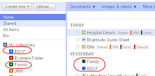 2. Collection icons now appear in the "Home" and "All Items" views of the newer version's documents list - these used not to appear in the older version. Why have they suddenly appeared in the list? They tend to clutter up the main pane and duplicate what is already visible in the "My Collections" outline in the left pane. Yet again, this is pretty stupid. I assume this is a bug rather than a deliberate design decision but, in view of the other changes that have been foisted on us, I cannot be sure. If this really is by design, then at least users should be given the choice to not have them appear in the main list BUT to still have them appear in the left hand pane.
Edited on 5 March 2011:
Point 2) above is one of the few things that has been put right. Now a collection can appear in the "My collections" list in the left hand pane but NOT also appear in the main list. But why on earth was this not tested properly in the first place? How can the Google Docs team have not seen such an obvious fault?
Note: Collection identifiers (folders) are now appearing in the older version, too. This happened at the same time as the newer version was released. If you click on a collection identifier (folder) you will see the documents within that collection. But we also see the documents in other collections as well because we have All Folders set. So now we have the main pane cluttered with duplicated documents. This is quite absurd.
See the example to the right taken from the older version. As you can see, if you click on "Example Folder", the file names appear twice! So not only is the newer version awful, Google has also managed to muck up the older version too.
Interestingly, in the newer version, if you drill down on the "Example Folder" collection (by clicking on it), you just see those documents in that collection. So the behaviours are different between the two versions.
But the point is that these collection identifiers (folders) should only appear in the left hand pane, they should not be in the main pane.
Having just made the screenshot to the right, I now see that in the older version the collection identifiers (folders) are no longer appearing in the main pane !!! There seems to be a stability issue at play, too. If I switch back to the newer version and then switch back again to the older version, the folders re-appear!
F. Refresh Link Removed The "Refresh" link in the older version (visible top right) has gone in the newer version. So you make a change in a document but that change is not reflected back in the Google List window. You have to hit the F5 key to get an up-to-date view of the document list. Another oversight?.
I know there are other serious problems with this refresh, particularly for users who are administrators. I am only attempting to deal with the user interface changes (that's keeping me busy enough) but for details of what others have found, see the links below and probably elsewhere on the internet. I sincerely hope that Google does not decide to make this refresh permanent. It needs a ton of work before it is ready for prime time. In the meantime, they should make the older version the default and admit that they have got it wrong big time.
Other users' opinions:
The majority of users who have posted comments are extremely unhappy with this ridiculous refresh. And many of these users are "power users" who would normally welcome sensible improvements. I would imagine that customers who are paying for Google Docs and using it for their livelihood will consider looking elsewhere (Dropbox?) as soon as the "Older version" link is threatened with removal.
* Here are the reactions of other users posting on the Google Docs Blog page:
http://googledocs.blogspot.com/2011/01/refresh-to-documents-list.html
* Here is what people have to say on the Google Docs help forum:
http://www.google.com/support/forum/p/Google+Docs/label?lid=1222793079d1eddb&hl=en
* Here are my original observations in the same Google Docs help forum:
http://www.google.com/support/forum/p/Google+Docs/thread?tid=327b78beafe120ba&hl=en
Some choice quotes from the Google Docs user community:
11 February 2011
"...New Google docs UI is visually confusing and rather unintuitive. I can't see any benefits; seems to be some lost functionality in some areas. I switched to Google docs because it was clear and simple to figure out. Please don't pull the same mistakes other large vendors have. Please do UI studies -- with real world users, not just internal engineers/developers before rolling changes like this out to the general public. Thanks. I'd like to stay with Google docs, but if it takes me 20 minutes to figure out whether I can open a new Folder or "Collection" or whether I'm stuck with "Collections" I already have.....Not good.."10 February 2011
"...As the administrator of an academic collaboration site, I cannot find anything in the new Docs List release that is an improvement on what was a quite useful cloud application. ...8 February 2011 - This user wittily "congratulates" Google.
I am also a Dropbox user, and have moved all of my own working documents and most of our library documents onto it. The only reason I haven't abandoned Google entirely is that Docs cloud storage is much less expensive than Dropbox's and that their shared documents decrement everyone's storage that is involved in the share.
If Google has any real pretensions to make money from selling commercial access to their cloud applications, whoever was responsible for this fiasco should be fired as they are obviously incompetent and not concerned to develop/deliver products that will be attractive to customers...."
These comments made me take note of the older version. Hadn't noticed how well organised the old version was:7 February 2011
1) It's so easy to sort items correctly by column!
2) Folder tags are large and clear, and there are so many colours to choose from.
3) I can quickly see the last collaborator on a project, and the time of the last edit.
4) Hiding unwanted items is simple and intuitive.
5) The design mimics Gmail's expertly honed UI - a synch to adapt to.
Thanks Google Docs for the old version. It's a real improvement over the new one.
"... I'm angry that my color options were halved when I didn't even have enough color options before. When you have a lot of docs and files, the lack of color selection becomes utterly useless: you might as well remove it entirely because it serves exactly the same purpose as the star, but poorer. And it's made worse by the fact that the color doesn't affect the collection name or even highlight the collection name: what's the point, exactly, of selecting a color and having it reduced to essentially a dot? It adds nothing to the experience at all. Colors are now useless and should be reverted to the old functionality or removed entirely.6 February 2011
...
White is everywhere. It's excessive. It's hard on the eyes. It's painful, really. I spend 10-12 hours a day looking at a computer screen and I'm not used to my eyes hurting like this..."
...
It's a shame when adding new, helpful functionality results in the loss of a lot of existing, great functionality. As a software engineer, I find such situations intrinsically demotivating and painful. I think the Docs team does great work, but I also hope they re-release some of the old functionality soon. I'm paying for extra storage, and sooner or later I'll be wondering why..."
"...I can hardly look at the new google docs. Everyday when I open my google docs it makes me frown as I quickly click on the "Older Version" link. The new version just looks like a sea of whiteness. It takes a ridiculous amount of effort to find and determine what the labels are on the documents. Previewing the docs singly in the right-hand column is obnoxious, when in the older version you just glance at the list and all that info is there. Please return the fully colored labels to the newer version!..."
"...The functionaliy of Docs is gone. My organization system is trashed. Everything is a jumbled mess. This was a HORRIBLE redesign, and I can only hope that Google realizes the mistake and responds quickly, or it seems like they're going to lose a lot of users. For the time being, I'm going all-Dropbox while I wait to see if they sort out the mess or not..."5 February 2011 - The user below makes the very good point that this has echoes of the Buzz debacle. Yes it does.
"...I swear this feels like an attempt to make Docs into a social networking hub and I'm not at all on board with that. I use Docs for business. I don't want to have to worry about spreadsheets and sensitive data suddenly appearing on other sites I work on. I moved all my files out. It's not just the poor handling and missing features, now I'm concerned with sharing going a bit too far and beyond my control. I don't care if Google gets any info from the documents. There's nothing sensitive in that manner. But I can see my clients going bonkers when my public files show up in their All list. That's bad. Because a file is public doesn't mean list it in all your contacts lists. This smacks of the Buzz debacle. ..."
"...Gmail sets the gold standard here - its interface has gotten very clean and intuitive, with MANY customizations possible. Messages open right in the window, with no visible refresh of the page. For short memos and such, it is easier to write in Gmail. There is much more free storage available there. I would really like to see full integration of the two. At the very least,you could copy as many of the options from Gmail as possible - checkboxes, labels, "inbox", aka current workspace; automated filters, etc. If the two were identical twins, left hand and right hand, people who use both apps all day every day would waste much less time "remembering" how to do something. The older version was MUCH closer to integration. At least don't take it away from us..."
"...Honestly. You have to wonder is anyone actually WORKING with these programs before releasing upgrades? Google seems to keep "tinkering" with programs that already are very good. Maybe some of the new hires (the ones replacing the employees that have left for Facebook) feel the need to put their "stamp" on something at the expense of people like me.
I cannot believe how lame this update to docs is..."
"... The new interface is a giant step backward in usability and features have been removed. The Gmail type interface worked extremely well. Now there's this "clever" interface that's made a mess of things. I spent the morning re-hiding things I did not need to see, looking for things that are not showing up, trying to find documents and trying figure out what keystrokes now do what a mouse-click did before. By the hour, things are populating the list making it more cluttered. Do I need to see Android Market apps and Extensions in All? All is now collection things from every shared folder I've ever worked on cluttering up the list. Yes, I could use Home but it shouldn't happen..."
"...I immediately liked the last major refresh of the list, and was even initially impressed by the new version. It was only when I started to use it that I quickly realised that it wasn't an improvement, but the opposite (although there are one or two new features that are useful and which could be kept).
I wish there were at least an option in the settings to set the old version as the default..."
"...Thumbnail view no longer exists (as an alternative to list view). Thumbnails were very useful to find the right document at a glance. For those of you who perhaps never ever noticed that feature (I found it very late), it was not thumbnails with some rather meaningless icon for the document type, no, it was a miniature of the document itself. (Like in the new detail pane on the right, but for all the documents at once.)..."
"... the new Doc's Home page is not good and I'm being generous. I've downloaded the majority of my files back to my computer and put my plans on hold for upgrading to an Apps account. The remaining few files I'm moving to Dropbox..."
"...Don't you test this stuff with genuine users before you release it? You might as well be Microsoft at its worst! As many before me in this blog have iterated, the new user interface offers very little new functionality that is useful at the expense of removing or hiding? much of the old functionality that actually allowed us to manage content in the Docs environment. This whole exercise is a massive slap in the face to any commercial organization who might have been considering adopting Docs as a corporate or even departmental content management environment.... ...The present episode makes me seriously doubt the wisdom of continuing with a system where releases of new functionality are as badly managed as this one has obviously been...."
7 comments:
Other things you can't do:
* sort descending
*choose a default view (e.g. open in a particular "folder")
*distinguish old and new style text docs by icon
*shrink the right pane, so if you have a small screen you can't see the middle panel properly
*and if you remove the collection items from the "home" view they vanish from the left nav pane as well. Help!!!!
This is a great summary of the problems with the new Docs release. I hope Google takes action on this quickly.
I totally agree. I do need the date next to my documents. It's hard when they are all over the place with no organization. I am getting really frustrated! I hope Google does something about this!!!
I do not have the time to check the date each document was started.
I'd have hoped the introduction of the new editor last summer might have taught the Google Docs group some caution about imposing change, especially change that cavalierly erodes familiar functionality to support new features of dubious utility.
I'll evaluate the upcoming changes to the docs list when they appear, but I remain skeptical.
Along with the editor change, this UI change erodes my confidence in a product I used to endorse enthusiastically. Google Docs in 2011 is less useful to me now than it's been in previous years; I'll continue to use Google Docs for as long as I can use the old editor (or until a similar minimalist, variable width output-agnostic editing function is reintroduced), but with this UI change as well I'm glancing more frequently and more anxiously towards the exit door.
Well said, Andrea – I'm in the same position.
It's hard to believe such a screw-up in user interface design.
Its as if who ever made the changes for Google Docs has less then a 5th grade education and never have used the App.
Its not friendly
It messes up a lot
Its not worth paying for
Its hardly worth FREE anymore
I HATE IT so much.
the collection concept is what really bugs me.
ALso, they give only 1GB free wheres gmail will provide you more free space, even though gmail was made only for mails and not large files.
sheesh google seriously need to kick the product managers of google docs out.
Post a Comment